Avoid These 10 Data Storytelling Mistakes That Undermine Your Expertise

Advertising Strategy

In this post

Avoid 10 data storytelling mistakes and try these tips instead to better communicate digital marketing performance — good and bad.

This post originally appeared on Search Engine Journal

The reality of how difficult it is to communicate both simple and complex ideas effectively became abundantly apparent to me very early on in my career.

Data storytelling is both an art and a significant skill.

While this article focuses on optimizing communications relating to reporting SEO and PPC results and initiatives to clients, the principles apply to all forms of communication.

Here are 10 blunders to avoid when communicating performance, insights, and strategy in a business environment. You’ll also find suggestions that will level up your reporting to clients and internal stakeholders.

Table of Contents

1. Not Using Visual Cues in Data Storytelling

Any decent reporting is going to have a visual element. After all, we’re visual creatures.

Good reporting visually calls out what is significant. A few examples include:

Simple, clean visualizations that leave little room for interpretation.

As pictured above, the goal is to report on engagement using wedge metrics between awareness and demand gen initiatives. The logic is clear and rational.

Using formatting (eg. font-weight, color) to emphasize key callouts.

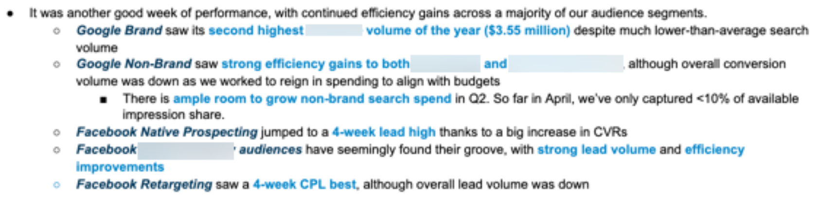
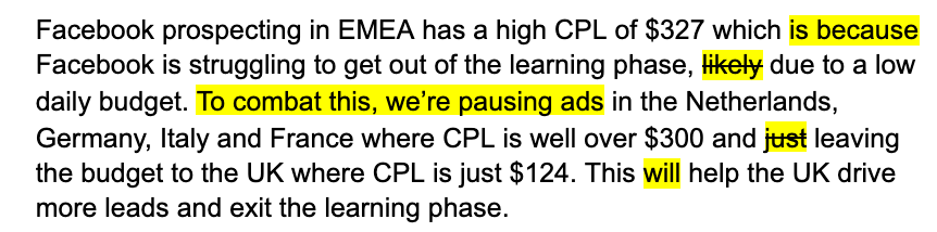
Highlighting key table data.

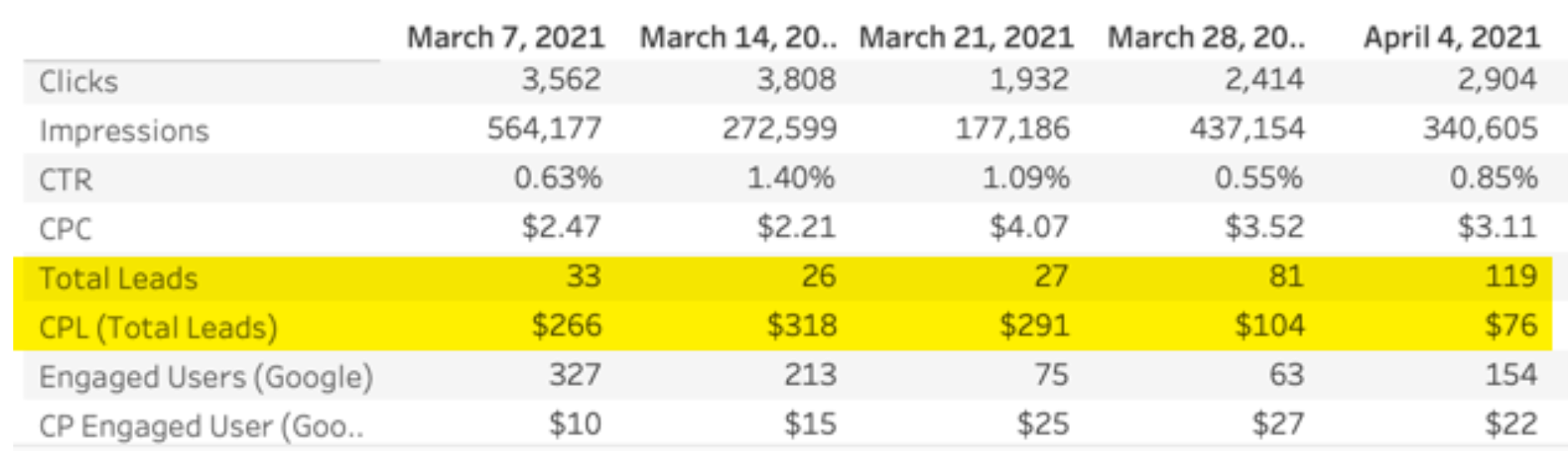
A data table with many stats is not ideal as it requires the reader to interpret what the callout is.

However, there’s a time and place for it. In those situations, bring attention to the rows/columns/cells that are important.

2. Telling a Story Without Context

As part of the onboarding process of a new client, I often receive a data dump with past reporting. More often than not, the previous reporting left much to be desired.

Often, the “why” (context) is missing.

Yet, including context in data storytelling is one of the easiest ways to make your client reporting more effective.

Clients don’t pay you/your agency to regurgitate statistics. They pay for your ability to drive results and provide insights.

If there is a meaningful change in performance, you must give context in addition to the stat. Going a step further, the context you provide should differ depending on the situation.

I follow a general rule of thumb: Lead with the stat when results are good and lead with context when results are lackluster.

If it was an off week, leading with context helps clarify the “why” before the reader has an initial negative reaction.

For example, instead of:

Lead volume dropped 70% week-over-week. This was due to us taking [whitepaper A] out of rotation.

Try this:

Taking [whitepaper a] out of rotation led to a 70% drop in lead volume week-over-week.

It’s a subtle, but impactful difference. In the event of delivering subpar results, starting with context helps reduce the negative emotions.

Even if performance suffers due to something outside of your control, you should be aware of perception and craft your reports to mitigate mixed emotions.

Pro Tip: Reporting must balance the amount of information provided. Adding hyperlinks with additional context helps to strike that balance.

Providing platform screenshots, screen share videos, data visualizations, and support articles helps provide additional information without the noise that adding all of that content inline would create.

My go-to tool is Snagit, with which you can take screenshots (or screen shares + voiceovers), mark them up, and upload them to a publicly accessible URL like Google Drive.

3. Showing a Lack of Confidence

Whenever you communicate with clients, you should be reinforcing your expertise. Your deep knowledge should shine through.

For example, how does the below compare to the 2nd option in your mind? What emotions are evoked?

“Google recommends that we add a call extension to our search ads. This allows users to click to call a designated phone number. Is this something that we want to add?”

Compared to:

“We advocate for utilizing Google call extensions to our search ads. This gives users another way to convert, as well as increases quality score. In the past, we haven’t had the call center to field such calls, but I wanted to check in case that has changed.”

Each example has the same recommendation. However, the second example:

  • Gives a bit more detail.
  • Takes the credit.
  • States the recommendation.

It doesn’t beat around the bush. It doesn’t stop and ask questions.

Instead, it instills the reader with confidence that you have a strong point of view and aren’t afraid to share it.

Here’s another example:

The “widget a and b” search campaigns are still pacing behind in spend, but we are working on increasing our bids using Google’s campaign simulator.”

In that example, the emphasis is on the tool’s value – Google’s campaign simulator — rather than on the value being brought to the table by your active management.

Compare to this:

“We’re working to maximize the volume of “widget a and b” search campaigns by using tools like Google’s campaign simulator, as well as monitoring and making adjustments based on metrics like Search Impressions Share, click share and absolute top of page Impression Share.”

Here, the focus is shifted toward the actions taken by the individual using a tool. It also expands upon the statement and showcases the expertise and authority of the writer.

4. Not Being Authoritative

One of the pieces of feedback agencies often receive is they aren’t strategic enough.

Regardless of how strategic an agency is, if communication isn’t definitive and authoritative, that “not being strategic” feedback is likely to be received.

Example:

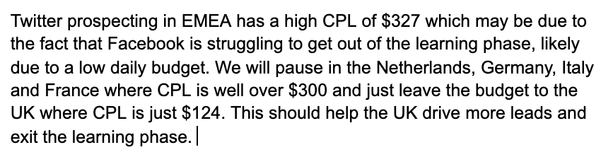
Here, the text does a great job at providing a summary of performance, the context, and a course of action.

However, there are a few subtle tweaks that can increase authority during data storytelling:

Even subtle tweaks aimed to be more authoritative lead to substantial differences in perception

3. Setting the Tone Late

The first statement you make is incredibly powerful. It sets the tone for what is to come.

By thinking through what key message and emotion you want to leave people with and leading with language that supports that goal, you maximize the chances of your desired outcome.

If you are doing a weekly report and performance was strong for that reporting period, don’t bury the lede. If you have a report mixed with both good and bad news, consider leading with the good.

Example (original):

Lead volume dropped 25% last week as we shifted our focus toward lower value, lower cost conversion points. This led to a 20% improvement in CPL.

Example (revised):

CPL improved 20% last week as we shifted our focus toward higher-efficiency, lower value conversion points. As expected, this led to a 25% drop in lead volume.

In the second example, we start with the good news and make it clear we were aware of the possible outcomes.

4. Making Assumptions

I’ve repeatedly learned during my career that assumptions about what people know are wildly inaccurate.

What is crystal clear for you may not be the same for everyone. This is also true in reporting.

In the example from #5, the “As expected” statement clarifies something that I often see people just assume a client knows. Try to avoid that.

This is extremely important. Due to the upcoming tracking limitations, according to Facebook, “When a customer takes several actions during a web session, only the corresponding event that’s highest in priority will be sent to Facebook for a conversion.”

Therefore, Add to Cart < Initiate Checkout < Purchase

7. Speaking Without Purpose

Words matter.

Words are powerful.

While many words share similar definitions, the intent behind those words often carries differing weights.

One word can change the emotion evoked by the reader. For example, which of the below statements leave you with the most positive emotions when communicating via data storytelling?

  • Option 1: Performance was stagnant week-over-week.
  • Option 2: Performance was flat week-over-week.
  • Option 3: Performance held steady week-over-week.

The third option leaves you with the most positive emotions with the use of “steady” as a descriptor. “Steady” carries a positive meaning with implications of secured posture, balance, and stability compared to “stagnant” and “flat” which often negatively imply lack of growth or movement.

Default to positivity whenever possible, so long as it is truthful.

8. Not Knowing Your Audience

A report meant for a marketing manager will differ considerably from a report meant for executive leadership.

Reporting for subject matter experts should differ from non-specialists. Craft and tailor your report based on what is most significant to your audience.

For executives, keep things high level and incorporate big picture trends. For managers, get into more of the tactics.

Pro Tip: Preparing for important executive reporting calls like quarterly business reviews can be daunting. It can be a challenge to find the sweet spot of high-level views and detail.

To circumvent this in your slides, add an appendix section that you can quickly reference should the conversation merit an on-the-fly pivot.

9. Being Shy About Your Wins

Humility is a fantastic trait to have. However, in business and with clients, there must be a balance between humility and assertiveness.

Don’t be afraid to own your wins.

For example:

“[Keyword] conversions on Google search are up 184% MoM with CPL down 36%. This is thanks to long-tail terms being on a tCPA bidding strategy, as well as more budget being pushed toward those assets and keywords.”

Compared to:

“In addition to adding more assets to the mix and increasing budget, we segmented long-tail KWs in groups so we could activate tCPA for our best performers, which led to widget conversions on Google search being up 184% MoM with CPL down 36%.”

Always take credit when pivoting has a positive impact on performance.

10. Diluting Your Main Takeaway

Digital marketing isn’t getting any less complicated, and neither is data storytelling. The amount of data the average marketer has at their disposal has increased substantially in the last decade.

An in-house marketing manager or agency’s primary responsibilities are distilling complex information and panning for gold. Strong marketers analyze massive data sets and call out the nuggets of wisdom in their reporting.

One of the easiest ways to cut down on the noise and be concise is to use lists and bullets.

Conclusion

So, there you have it — 10 ways to tank your data storytelling. By avoiding these basic mistakes and implementing the principles I have shared, you’ll:

  • Simplify the information conveyed.
  • Improve understanding and perception.
  • Ensure credit is given where it is due.
  • Build authoritativeness and credibility.
  • Reinforce that you’re the person for the job.

It's Finally Here

Average is Losing: A Playbook for Dominating Digital Advertising

My new book, “Average is Losing” is finally here! I created this playbook to help savvy advertisers close the gap between winning and run-of-the-mill paid advertising campaigns.

It’s filled to the brim with the latest strategies, tactics and tips our Closed Loop experts use to help our clients seek exponential growth.

Are you ready to rise above average campaign performance? Start your business on the path to PPC domination today!

– Lance Loveday